We can play the game at this point and keep score, but we don't have any scorekeeping display so the user can't see their score. We're going to cover two pieces of functionality to show the score (and some other UI): Bevy Plugins and UI layout.
UI in Bevy lives on its own layer with its own camera. When working with Bevy UI it feels like it would work well as a HUD in a 3d shooter or 2d platformer. 2048 is none of those things, so the orginal game UI feels a bit awkward to build because it was built on the web, which is a single-layer.
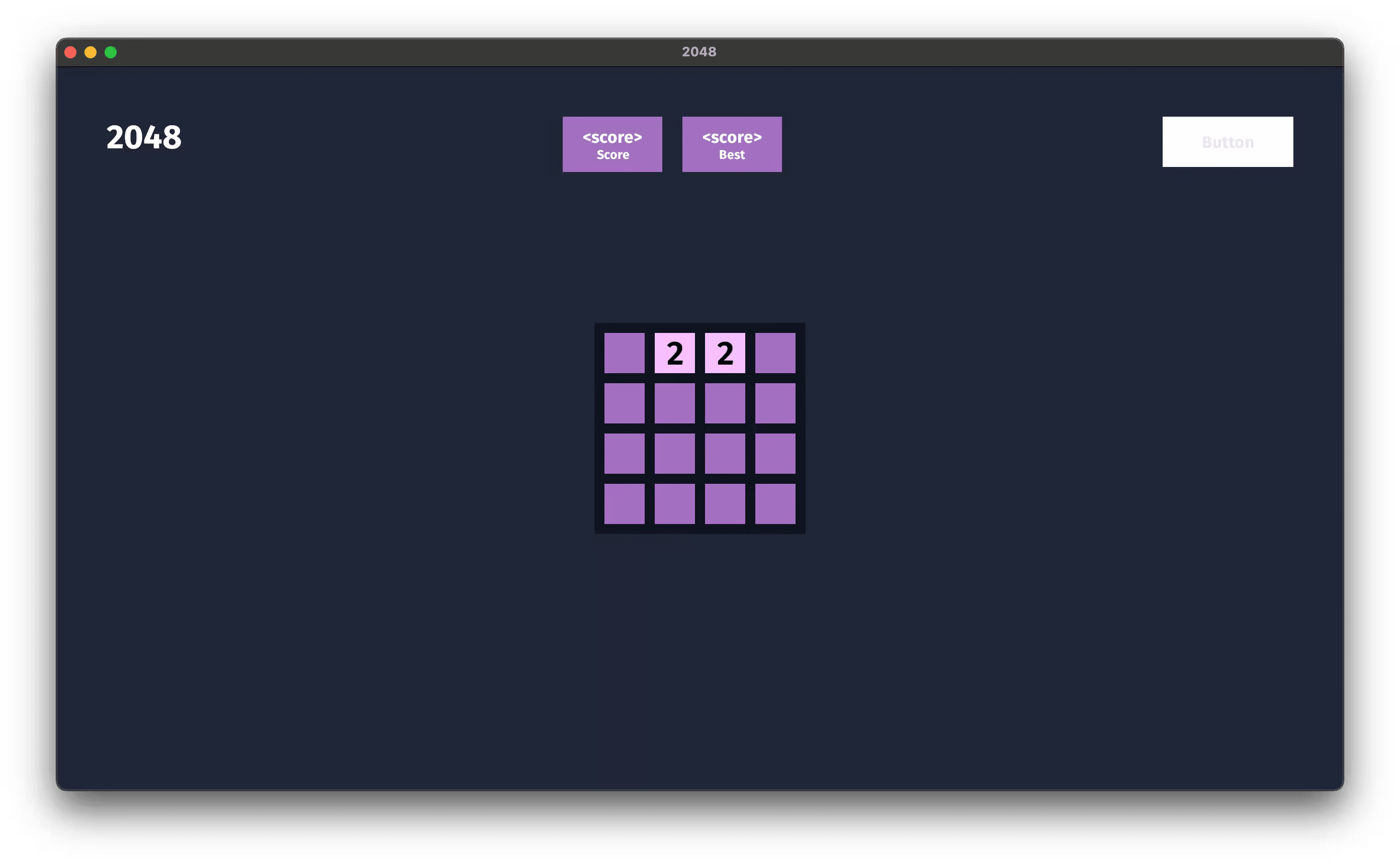
We'll be going with a UI layout that displays the game name (2048) on the left, score display in the middle and a "new game" button on the right.
:2048: :score: :best-score: :new-game:
Since the UI isn't directly affecting the game logic, we can put the UI layout and logic in its own module.
In main.rs we're going to declare a new sub-module called ui right next to where we defined colors.
mod colors;
mod ui;
Module paths in Rust often mirror the filesystem but they aren't required to. mod ui in our case does point to a file (at src/ui.rs), but we could also have written mod ui {} and put all of the relevant code inside of the module's block (between the braces). Either way it functions the same.
In src/ui.rs we'll start by adding a new struct to represent our plugin. This plugin is going to be responsible for dealing with all of the UI related concerns, so I'll name it GameUiPlugin.
pub struct GameUiPlugin
The pub before it makes it so that main.rs can access the struct. Specifically, we're going to use add_plugin in main.rs on our App builder, passing the GameUiPlugin struct as an argument.
.add_plugin(ui::GameUiPlugin)
Back in ui.rs we're going to bring Bevy's prelude into scope in the ui module.
use bevy::prelude::*;
Bevy Plugins are a way to organize groups of related functionality. Similar to the way we set up our game with an App builder, we can do the same in a plugin and then add that plugin to the main App instead.
To do that we are going to implement the Plugin trait for GameUiPlugin which requires us to implement the build method to satisfy the trait.
You'll notice the implementation is very similar to our App in main.rs. We only have one startup system at the moment (setup_ui), but as we add more systems to handle updating the UI, they will also go here.
impl Plugin for GameUiPlugin {
    fn build(&self, app: &mut App) {
        app.add_startup_system(setup_ui);
    }
}
If you're familiar with html, we're about to build a structure like this.
<div>
  <span>2048</span>
  <div>
    <div>
      <span>Score</span>
      <span>200</span>
    </div>
    <div>
      <span>Best</span>
      <span>200</span>
    </div>
  </div>
  <button><span>Button</span></button>
</div>
This is a three-column layout where the middle column is a set of two boxes that holds the current score and the top score ever achieved.
We'll be using three bundles to build the UI: NodeBundle which is like a div, TextBundle, and ButtonBundle.
The commands we're command to use are .spawn, which we've seen before, with_children, and insert.
We'll use spawn to create each of the bundles we talked about earlier: NodeBundle, TextBundle, and ButtonBundle.
.with_children will give us a builder for the entity we just spawned. For example, the following code with spawn a NodeBundle, then spawn a TextBundle as a child of the NodeBundle.
commands
    .spawn(NodeBundle {...})
    .with_children(|parent| {
        parent.spawn(TextBundle {...});
    });
The full layout will look like this. I’ve removed all of the fields so that you can see the structure of the nodes, text, and buttons.
commands
    .spawn(NodeBundle {..})
    .with_children(|parent| {
        parent.spawn(TextBundle{..});

        parent
            .spawn(NodeBundle {..})
            .with_children(|parent| {
                // scorebox
                parent
                    .spawn(NodeBundle {..})
                    .with_children(|parent| {
                        parent.spawn(TextBundle{..});
                        parent.spawn((
                            TextBundle{..},
                            ScoreDisplay,
                        ));
                    });
                // end scorebox
                // best scorebox
                parent
                    .spawn(NodeBundle {..})
                    .with_children(|parent| {
                        parent.spawn(TextBundle{..});
                        parent.spawn((
                            TextBundle{..},
                            BestScoreDisplay,
                        ));
                    });
                // end best scorebox
            });

        parent
            .spawn(ButtonBundle {..})
            .with_children(|parent| {
                parent.spawn(TextBundle {..});
            });
    });
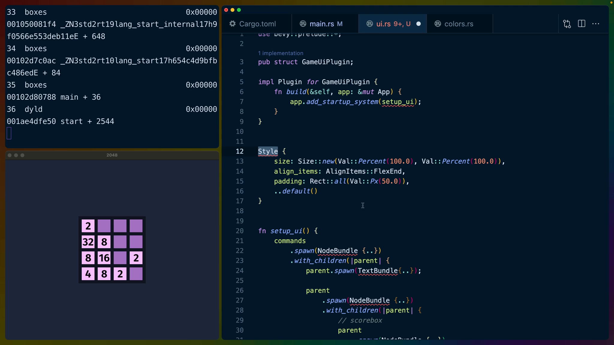
All styles and positioning are handled through creating structs. A NodeBundle for example, accepts a style field that takes a Style struct. The Style struct has a number of fields that accept additional structs or enums. For any fields we construct the values we want to change or control, and leave the rest to their default implementation using update struct syntax.
The Size struct has a method called new, which is a common pattern for structs in general in Rust. The new method takes two Val enums for how wide and tall the node should be. In this case we use percentage values. We could have also used Val::Px or Val::Auto.
The default layout (or display) mechanism in Bevy is flexbox so we can use that.
Style {
    size: Size::new(Val::Percent(100.0), Val::Percent(100.0)),
    align_items: AlignItems::FlexEnd,
    padding: Rect::all(Val::Px(50.0)),
    ..default()
}
Lastly, we need to label some of the text fields so that we can access them later. After we spawn the TextBundles, we can insert ScoreDisplay and BestScoreDisplay components to use later in a system to update them.
parent
    .spawn_bundle(TextBundle {...})
    .insert(ScoreDisplay);
We repeat these patterns to create the whole UI as such.
use bevy::prelude::*;

use crate::{colors, FontSpec};

mod styles;

pub struct GameUiPlugin;

impl Plugin for GameUiPlugin {
    fn build(&self, app: &mut App) {
        app.add_startup_system(setup_ui);
    }
}

#[derive(Component)]
pub struct ScoreDisplay;

#[derive(Component)]
pub struct BestScoreDisplay;

fn setup_ui(
    mut commands: Commands,
    font_spec: Res<FontSpec>,
) {
    commands
        .spawn(NodeBundle {
            style: Style {
                size: Size::new(
                    Val::Percent(100.0),
                    Val::Percent(100.0),
                ),
                align_items: AlignItems::FlexStart,
                justify_content:
                    JustifyContent::SpaceBetween,
                padding: UiRect::all(Val::Px(50.0)),
                ..default()
            },
            ..default()
        })
        .with_children(|parent| {
            parent.spawn(TextBundle::from_section(
                "2048",
                TextStyle {
                    font: font_spec.family.clone(),
                    font_size: 40.0,
                    color: Color::WHITE,
                },
            ));

            parent
                .spawn(NodeBundle {
                    style: Style {
                        justify_content:
                            JustifyContent::Center,
                        size: Size::AUTO,
                        gap: Size::all(Val::Px(20.0)),
                        ..default()
                    },
                    ..default()
                })
                .with_children(|parent| {
                    // scorebox
                    parent
                        .spawn(NodeBundle {
                            style: styles::SCORE_CONTAINER,
                            background_color:
                                BackgroundColor(
                                    colors::SCORE_BOX,
                                ),
                            ..default()
                        })
                        .with_children(|parent| {
                            parent.spawn(
                                TextBundle::from_section(
                                    "Score",
                                    TextStyle {
                                        font: font_spec
                                            .family
                                            .clone(),
                                        font_size: 15.0,
                                        color: Color::WHITE,
                                    },
                                )
                                .with_text_alignment(
                                    TextAlignment::Center,
                                ),
                            );
                            parent.spawn((
                                TextBundle::from_section(
                                    "<score>",
                                    TextStyle {
                                        font: font_spec
                                            .family
                                            .clone(),
                                        font_size: 20.0,
                                        color: Color::WHITE,
                                    },
                                )
                                .with_text_alignment(
                                    TextAlignment::Center,
                                ),
                                ScoreDisplay,
                            ));
                        });
                    // end scorebox
                    // best scorebox
                    parent
                        .spawn(NodeBundle {
                            style: styles::SCORE_CONTAINER,
                            background_color:
                                BackgroundColor(
                                    colors::SCORE_BOX,
                                ),
                            ..default()
                        })
                        .with_children(|parent| {
                            parent.spawn(
                                TextBundle::from_section(
                                    "Best",
                                    TextStyle {
                                        font: font_spec
                                            .family
                                            .clone(),
                                        font_size: 15.0,
                                        color: Color::WHITE,
                                    },
                                )
                                .with_text_alignment(
                                    TextAlignment::Center,
                                ),
                            );
                            parent.spawn((
                                TextBundle::from_section(
                                    "<score>",
                                    TextStyle {
                                        font: font_spec
                                            .family
                                            .clone(),
                                        font_size: 20.0,
                                        color: Color::WHITE,
                                    },
                                )
                                .with_text_alignment(
                                    TextAlignment::Center,
                                ),
                                BestScoreDisplay,
                            ));
                        });
                    // end best scorebox
                });

            parent
                .spawn(ButtonBundle {
                    style: Style {
                        size: Size::new(
                            Val::Px(130.0),
                            Val::Px(50.0),
                        ),
                        justify_content:
                            JustifyContent::Center,
                        align_items: AlignItems::Center,
                        ..default()
                    },
                    ..default()
                })
                .with_children(|parent| {
                    parent.spawn(TextBundle {
                        text: Text::from_section(
                            "Button",
                            TextStyle {
                                font: font_spec
                                    .family
                                    .clone(),
                                font_size: 20.0,
                                color: Color::rgb(
                                    0.9, 0.9, 0.9,
                                ),
                            },
                        ),
                        ..default()
                    });
                });
        });
}
Notably we’re also using a new color in colors::SCORE_BOX.
pub const SCORE_BOX: Color = Color::Lcha {
    lightness: 0.55,
    chroma: 0.5,
    hue: 315.0,
    alpha: 1.0,
};
and we’ve created a new styles module from our ui module. Not all of our styles need to be placed here, only the ones we’re re-using across elements.
The big interesting note here is that the Default::default() trait’s function isn’t const, which means it can’t be evaluated at compile time. So if we want to set up a const with a type of Style, Bevy has provided a temporary workaround for us. In this case, there is a const associated with Style that is arbitrarily named DEFAULT that we can use instead.
use bevy::prelude::*;

pub const SCORE_CONTAINER: Style = Style {
    flex_direction: FlexDirection::ColumnReverse,
    align_items: AlignItems::Center,
    padding: UiRect {
        left: Val::Px(20.0),
        right: Val::Px(20.0),
        top: Val::Px(10.0),
        bottom: Val::Px(10.0),
    },
    ..Style::DEFAULT
};
At the top we've used some structs using a new module path that starts with crate::.
use crate::{colors, FontSpec};
A crate in Rust is a tree of modules that produce a library or executable. A tree of modules can start at src/main.rs for executables, like we have, or at src/lib.rs for libraries. You can use other filenames for the crate root files, but main and lib are what you'll see the most.
We can use items from the current crate root then, by using the crate:: prefix.
In this case since we're writing use in an executable with the crate root at src/main.rs, crate:: refers to items in src/main.rs, such as FontSpec and colors.
Altogether this gives us the static UI elements that we'll update with the score in the middle of the screen.
The Button is supposed to be white, we’ll handle that in another lesson.

