We’re going to take the same approach that we took to wrapping our menu with the nine-patch green square and apply it to our buttons.
We’re also going to also build up some extra logic for swapping images when the button is clicked.
To do this we’ll create our own button widget. The button widget will turn our GameMenu usage into this. Each Button from before becomes a SnakeButton from the button submodule. All of the styles are in the SnakeButton widget, and the buttons can still accept event handlers.
rsx! {
    <If condition={show_menus}>
         <NinePatch
             styles={Some(container_styles)}
             border={Edge::all(10.0)}
             handle={container}
         >
             <button::SnakeButton
                 on_event={Some(on_click_new_game)}
                 >
                 <Text
                     size={20.0}
                     content={"New Game".to_string()}
                 />
             </button::SnakeButton>
             <button::SnakeButton
                 on_event={Some(on_click_settings)}
                 >
                 <Text
                     size={20.0}
                     content={"Settings".to_string()}
                 />
             </button::SnakeButton>
             <button::SnakeButton
                 on_event={Some(on_click_exit)}
                 >
                 <Text
                     size={20.0}
                     content={"Exit".to_string()}
                 />
             </button::SnakeButton>
         </NinePatch>
     </If>
 }
In ui.rs create a new button submodule. This does not need to be public as we won’t be sharing it outside of the ui module.
mod button;
The file we create for our button submodule will be in src/ui/button.rs.
Our button widget will be called SnakeButton and it’s declared in a similar way to the GameMenu widget. The biggest difference is that our SnakeButton widget needs to accept props, so we create an additional struct to define what props it takes.
We need to derive WidgetProps as well as a few other more familiar traits, and use prop_field on the props we’re defining. An Option means that we don’t always have to supply this prop. Only a specific subset of the props need this prop_field macro: the ones that Kayak defines for us. If we had a String prop it wouldn’t need the macro.
Any prop we’re going to use when we use the SnakeButton needs to be pub.
The widget’s return value is going to be a NinePatch instead of a button. This will let us use a nine-patch image as the background of our button. This image handle will also get swapped out when we MouseDown on the button.
We could put the Text component in our button as well, instead of accepting arbitrary children, but I’ve learned in my web-based work that defining just the container and allowing consumers to put whatever they want in that container is generally the better move for a re-usable component.
#[derive(WidgetProps, Clone, Debug, Default, PartialEq)]
pub struct SnakeButtonProps {
    #[prop_field(Styles)]
    pub styles: Option<Style>,
    #[prop_field(OnEvent)]
    pub on_event: Option<OnEvent>,
    #[prop_field(Children)]
    pub children: Option<kayak_ui::core::Children>,
}

#[widget]
pub fn SnakeButton(props: SnakeButtonProps) {
    ...
    rsx! {
        <NinePatch
            border={Edge::all(24.0)}
            handle={current_button_handle.get()}
            styles={Some(button_styles)}
            on_event={Some(on_event)}
        >
            {children}
        </NinePatch>
    }
}
Now that the button is a NinePatch, we also need to grab some of the default Button styles from the Button widget we were using. We’ll also copy in the styles we originally defined for our buttons.
When we cargo run later, you’ll notice that the background_color is no longer used, even though we set it.
We also take this opportunity to accept any styles the user of the widget might have set (or use the defaults) by using struct update syntax (..). This is a lot like a spreading an object in JavaScript, although not exactly the same.
You can also now remove the button styles from ui.rs.
#[widget]
pub fn SnakeButton(props: SnakeButtonProps) {
    let button_styles = Style {
        background_color: StyleProp::Value(Color::BLACK),
        height: StyleProp::Value(Units::Pixels(50.0)),
        width: StyleProp::Value(Units::Pixels(200.0)),
        padding_top: StyleProp::Value(Units::Stretch(1.0)),
        padding_bottom: StyleProp::Value(Units::Stretch(
            1.0,
        )),
        padding_left: StyleProp::Value(Units::Stretch(1.0)),
        padding_right: StyleProp::Value(Units::Stretch(
            1.0,
        )),
        cursor: CursorIcon::Hand.into(),
        ..props.styles.clone().unwrap_or_default()
    };
...
}
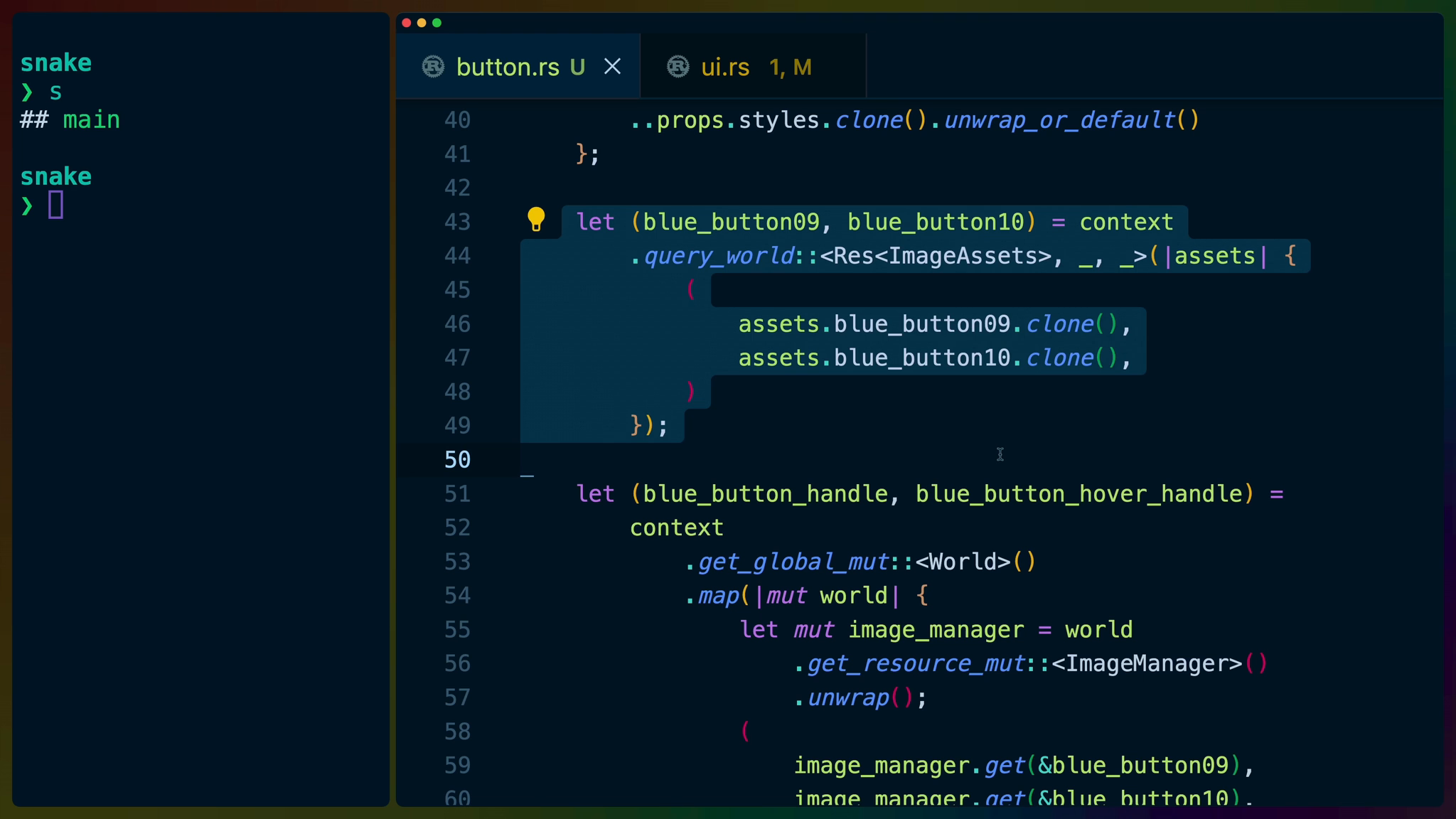
We’re going to use the exact same method of getting the image assets that we used for the last NinePatch. The biggest difference here is that we’re using tuples to return multiple handles and that we’ve given image_manager it’s own variable so we can call .get twice instead of once.
These will give us the images we use for the regular button state as well as the mouse-down state.
let (blue_button09, blue_button10) = context
    .query_world::<Res<ImageAssets>, _, _>(|assets| {
        (
            assets.blue_button09.clone(),
            assets.blue_button10.clone(),
        )
    });

let (blue_button_handle, blue_button_hover_handle) =
    context
        .get_global_mut::<World>()
        .map(|mut world| {
            let mut image_manager = world
                .get_resource_mut::<ImageManager>()
                .unwrap();
            (
                image_manager.get(&blue_button09),
                image_manager.get(&blue_button10),
            )
        })
        .unwrap();
If you’ve ever worked with state in a modern web framework, you’ll recognize this as something similar to use_state in React or similar concepts in other frameworks.
We create some state that Kayak will handle binding to for us. The state type is a u16 and the original value we set is the blue_button_handle.
We can change this value now and the component will react to the changed state.
let current_button_handle = context
    .create_state::<u16>(blue_button_handle)
    .unwrap();
Next we have our event handlers.
The event handler closure we construct will outlive the function we’re defining it in because we give it to the NinePatch widget which will call it... sometime, whenever the user clicks the button.
This is a problem because the variables we’re using like cloned_current_button_handle and parent_on_event will only live until the end of this function and the closure, which lives longer, is still trying to reference them.
We can use the move keyword to force the closure to take ownership of the variables it’s using which solves this problem. This is why we’ve cloned these values as well, because we’ll be sending the clones off to live with the closure forever.
If we didn’t clone them then, in the case of current_button_handle, we wouldn’t be able to use it after we moved it. In the case of on_event, it’s a partial move because it lives inside of the props struct, which means that we wouldn’t be able to use the props struct later.
If we weren’t using these values later in our rsx macro, then we could freely move them without cloning.
let cloned_current_button_handle =
    current_button_handle.clone();
let parent_on_event = props.on_event.clone();
let on_event = OnEvent::new(move |ctx, event| {
    match event.event_type {
        EventType::MouseDown(..) => {
            cloned_current_button_handle.set(blue_button_hover_handle);
        }
        EventType::MouseUp(..) => {
            cloned_current_button_handle.set(blue_button_handle);
        }
        EventType::Click(..) => {
            match &parent_on_event {
                Some(v) => v.try_call(ctx, event),
                None => todo!(),
            };
        }
        _ => (),
    }
});
Finally, we need to apply the user’s desired children to the button. We have to use props.get_children() outside of the rsx macro because of the way the macro works.
let children = props.get_children();
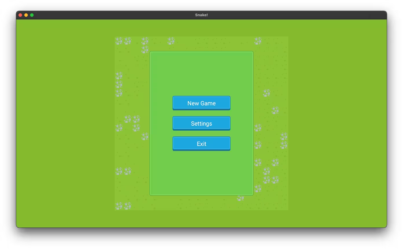
If we cargo run now, we see nice chonky clickable buttons in our menu!